
EN |
Contact Center Statistics
know the emotions that your brand awakens
Indice
- Report
- Word cloud
- Emojis
- Positivity over time
- Positivity throughout a conversation
- Active conversations
Report
If your contact center receives at least 300 messages on the same day from customers to agents (input messages) you will receive the following Monday and the first day of the following month a report like this:
Word cloud
TOPICS OF THE CONVERSATIONS
-
How it works
Once a week/month, the most used words are displayed in the form of a cloud. The larger the size of the word, the greater the frequency that it appears in conversations. -
What is it for? We can observe the words that customers use when communicating through the contact center to detect topics of interest, reasons why they use this channel to communicate with the brand. It can indicate if there is an incident with a specific product or if when launching a new service it generates many conversations to resolve doubts.
Emojis
EMOJIS WHICH YOUR CUSTOMERS USER TO EXPRESS THEMSELVES
-
How it works
It shows the times that users have used each emoji weekly/monthly. -
What is it for?
Emojis are increasingly used to be able to reflect in a simpler and more intense way the emotions we want to transmit. This graph allows us to quickly and visually analyze the emotions which users use to express themselves.
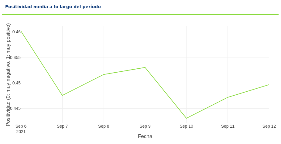
Average positivity over time
EMOTIONAL EVOLUTION OF YOUR BRAND
-
How it works
It measures, over time, what feeling is reflected in the contact center about the brand. The closer to 1 means that the emotion is more positive, if it is close to 0 the emotion is more negative and 0.5 would be neutral conversations. -
What is it for?
This graph measures the effectiveness felt by customers about the incidents and queries that the contact center attends and resolves. It helps us to analyze if there is any kind of evolution over time and answer questions such as: Are customers more or less satisfied now than before? Has it been possible to improve the quality that the agents are giving?
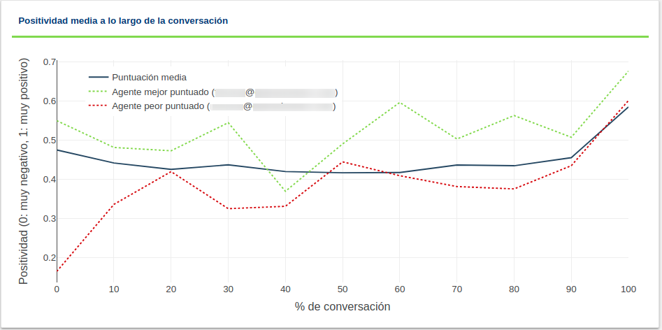
Average positivity throughout the conversation
EMOTIONAL MANAGEMENT IN A CONVERSATION
- How it works
It measures the development of a conversation from the emotional point of view. To do this, we calculate the degree of positivity of the messages at different points of the conversation: from the beginning of the conversation, at 0%, until its closure, at 100%. With a score of 0 for the most negative messages and 1 for the most positive. In the normal course of a conversation, positivity can be expected to fall at first, as the first message is usually a greeting to the agent, followed by an exposure of the incident or doubt, usually of a more negative nature. At the end of the conversation, on average, positivity increases, especially when the reason for the query is resolved and the user says goodbye with a thank you message. This analysis, for greater detail, is broken down into a global average which includes all the conversations of all agents. In addition, for each agent, the average positivity of the messages is extracted and, thus, it is estimated which are the agents with the best and worst performance, which are represented with a green and red dotted line, respectively. With these three lines, an idea is given not only of the general performance of the contact center, but also of the degree of deviation between the performance of different agents.
- What is it for?
It measures the resolving effectiveness of conversations, the general contact center and the degree of deviation between the performance of different agents. Is there much difference between agents?
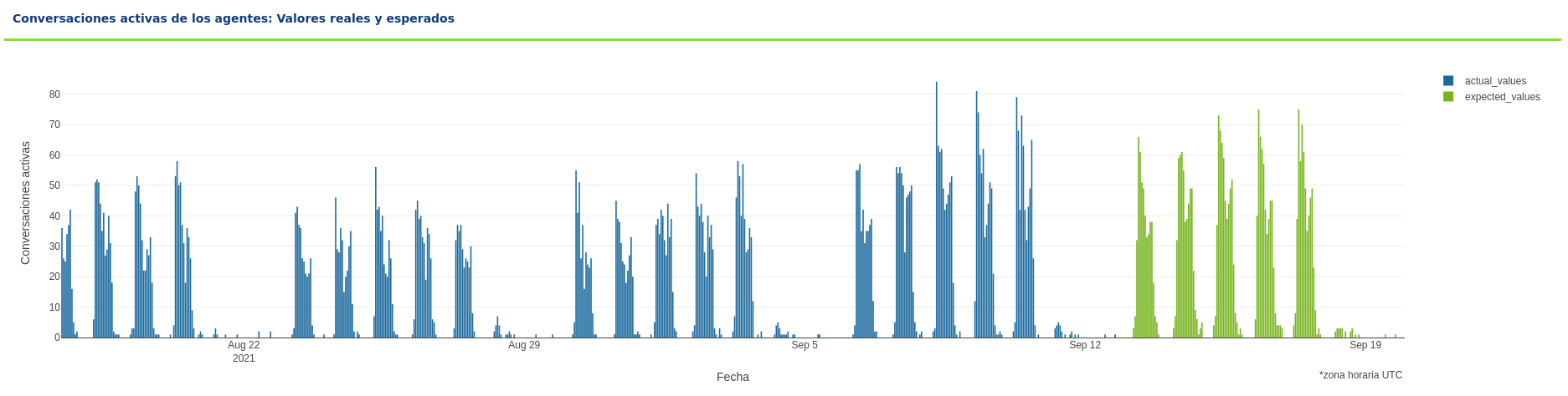
Active Agent Conversations: Real and Expected Values
PREDICTION AND HISTORY OF THE NUMBER OF CONVERSATIONS
-
How it works
The blue lines in the chart indicate the number of conversations produced per day and time of the last 4 weeks. The prediction of conversations in the coming week is shown in green lines. This report will only be displayed in the weekly reports at the time you have a history of 3 months from the first day that there were 10 messages. -
What is it for?
See the evolution of the number of messages that allow detecting trends in the use of the contact center, if there has been any anomaly such as peaks of incidents, change in the use of this channel and predict future conversations to be able to manage the number of agents that will be necessary during the next week.